I’ve been staring at Dr. Hex’s office for weeks now.
You know that feeling when you drive past a building and can’t look away? That’s this place. It’s weird. It’s bold. And honestly, it works in ways most exteriors don’t.
Here’s the thing: most homes look like every other home on the block. Safe colors. Standard layouts. Nothing that makes you stop and actually look.
Dr. Hex’s office breaks every rule I thought mattered. And somehow it tells a story that sticks with you.
I’m going to break down exactly what makes this exterior so different. We’ll look at the design choices that give it personality and figure out why they work when they probably shouldn’t.
At drhextreriorly, we study buildings that take risks. The ones that make you question what you thought you knew about design.
You’ll see how specific elements come together to create something memorable. Not just pretty. Memorable.
I’ll show you which concepts you can actually use for your own home. Because here’s what matters: understanding why something works so you can apply those ideas yourself.
No fluff about architectural theory. Just a real look at what makes this building different and what you can learn from it.
The Foundational Style: A Fusion of Gothic Revival and Industrial Grit
You’ve got two choices when you’re designing a statement home.
You can play it safe with one established style. Or you can do what most architects won’t tell you is possible: blend two completely different worlds.
Most people think Victorian Gothic and industrial elements can’t coexist. They’ll say Gothic is all about romance and history, while industrial design is cold and mechanical. Pick one or the other.
But that’s exactly the kind of thinking that leads to boring houses.
Look at what happens when you fuse these styles. You get pointed arches paired with exposed copper piping. Steep gables sitting above gear-like motifs. It shouldn’t work on paper.
Yet it does.
The building I’m talking about has an imposing silhouette that immediately grabs your attention. The layout isn’t symmetrical because symmetry would kill the mystery. Instead, the structure sprawls in unexpected directions, creating pockets of shadow and intrigue.
This is what I love about drhextreriorly design philosophy. It’s about telling a story through architecture.
Think about what this fusion actually communicates. The Gothic elements say tradition, craftsmanship, respect for the past. The industrial pieces say innovation, function, forward movement.
Put them together? You’re looking at a home that belongs to someone who values history but isn’t trapped by it.
Here’s how the comparison breaks down:
- Pure Gothic Revival: Beautiful but can feel like a museum piece
- Pure Industrial: Functional but often lacks warmth
- The Fusion: Gets you the drama of Gothic with the edge of industrial design
The trick is balance. Too much Gothic and you’re living in a church. Too much industrial and it feels like a factory.
Your takeaway? Don’t let anyone tell you that mixing styles is a mistake. Just make sure each element serves a purpose beyond looking cool.
Material & Color Palette: Crafting Atmosphere with Texture and Tone
You walk past most houses without a second thought.
But every once in a while, one stops you cold. You can’t quite explain why, but something about it just feels right.
That’s the power of materials and color working together.
Most design advice tells you to pick what you like and call it a day. And sure, personal preference matters. But what they don’t tell you is how specific material choices actually shape the way a space feels before you even step inside.
I’ve noticed something after years with drhextreriorly. The homes that really stick with you aren’t using exotic materials or complicated palettes. They’re using the right ones.
Take dark weathered brick paired with cold-rolled steel accents. The brick has this rough, almost gritty texture that feels permanent. Like it’s been there for decades (even if it hasn’t). The steel brings in a sharp contrast. It’s smooth and industrial where the brick is organic and aged.
Then there’s verdigris copper roofing. That blue-green patina doesn’t happen overnight. It’s what copper becomes when it reacts with air and moisture over time. Some people try to prevent it, but I think that’s missing the point entirely.
The weathering is the story.
Now let’s talk color. A palette of charcoal grey, deep oxblood, and metallic bronze sounds heavy on paper. But when you limit yourself to just a few tones, something interesting happens. The whole exterior becomes cohesive instead of chaotic.
That oxblood isn’t bright red. It’s darker, almost wine-stained. Pair it with charcoal and you get drama without screaming for attention. The bronze accents catch light differently throughout the day, which keeps things from feeling flat.
Here’s what most renovation guides won’t tell you. Patina and weathering aren’t flaws to fix. They’re features to plan for. When you choose materials that age well, you’re designing for five years from now, not just today.
If you’re planning your own project, start by deciding on the mood first. Do you want mysterious and dramatic? Or open and airy? Your material choices follow from there.
For dramatic, think about how materials absorb or reflect light. Matte finishes on brick or stone pull light in. Polished metal pushes it back out.
For airy, you’ll want lighter tones and smoother textures. But even then, adding one weathered element (like reclaimed wood shutters) gives you depth without losing that open feel.
Pro tip: Before committing to a full exterior palette, get physical samples of your materials. Hold them next to each other in natural light at different times of day. Photos lie. Your eyes don’t.
And if you’re wondering how should exterior shutters fit Drhextreriorly, remember that proportion matters just as much as color. A beautiful shutter in the wrong size throws off your entire material story. As you explore design tips on our , remember that just like choosing the right size for your exterior shutters, creating a harmonious aesthetic in gaming environments hinges on proportion and detail.
The best palettes aren’t about using every material available. They’re about using fewer materials better.
Fenestration and Entryway: The Eyes and Mouth of the Building

Your front door says more about you than you think.
Walk up to any home and you’ll notice it first. That heavy slab of wood or metal. The knocker. The way light hits the windows.
It’s not just about curb appeal (though that matters). It’s about what you’re telling people before they even step inside.
The Main Door Sets the Tone
I’m talking about a real statement piece here. Picture a heavy iron door with rivets running down the sides. The kind with a knocker so detailed you stop to look at it.
This isn’t your builder-grade option from the hardware store.
A door like this acts as a gatekeeper. It separates the outside world from what you’ve built inside. And honestly? I think we’re going to see more people invest in custom doors over the next few years. The mass-produced look is wearing thin.
Window Design Controls Everything
Now let’s talk about windows.
You’ve got options. Tall lancet-style windows with stained glass that breaks up the view. Small porthole windows that make you wonder what’s happening inside. Each choice changes how light moves through your space and how much privacy you keep.
I’ve noticed something at drhextreriorly. People are moving away from those massive picture windows everyone wanted a decade ago. They want character instead. Windows that make you curious.
My prediction? Stained glass is coming back. Not the church kind. Something modern but with that same light-filtering quality.
Hardware Makes or Breaks the Look
Here’s where most people mess up.
They spend thousands on a new door and windows, then slap on cheap hardware. Generic hinges. A light fixture from a big box store.
The details matter. Custom-forged hinges. Gas-lamp-style exterior lighting. Downspouts with actual design work.
These small pieces take a home from looking nice to looking intentional.
Start With High-Impact Changes
You don’t need to renovate everything at once.
Swap your front door. Update the window trims. Replace those builder-grade light fixtures with something that actually fits your style.
These projects give you the biggest visual return without tearing apart your whole exterior.
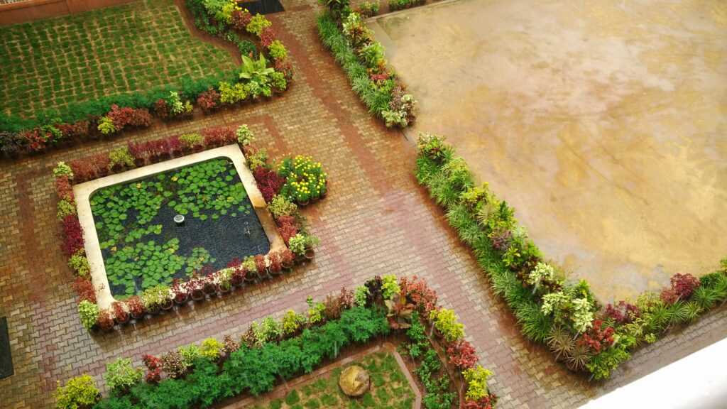
Landscaping and Grounds: The Supporting Cast to the Main Structure
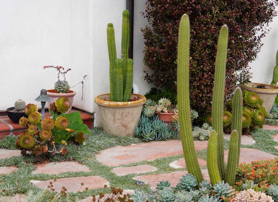
I’ll never forget the first time I walked up to a house with what I now call anti-garden landscaping.
It was in Portland. Dark twisted junipers flanked the entrance. No roses. No cheerful petunias. Just deep green foliage and architectural plants that looked like they’d been there for centuries.
The homeowner saw my face and laughed. “Everyone expects flowers,” she said. “But this? This actually FITS the house.”
She was right.
Here’s what most people get wrong about landscaping. They think it needs to be pretty. Bright. Welcoming in that traditional cottage-garden way.
But what if your home isn’t a cottage? What if it’s modern, moody, or just plain different?
That’s where the anti-garden concept comes in. You skip the flower beds and focus on structure instead. Think dark foliage plants like black mondo grass or deep burgundy heuchera. Twisted yew trees that look sculptural. Ivy that you actually maintain instead of letting it run wild.
It sounds counterintuitive (and your neighbors might give you looks at first). But it works.
The hardscaping matters just as much. I’m talking about cobblestone pathways that guide people to your entrance. Low wrought-iron fencing that frames your property without blocking the view. Moss-covered stones placed like they’ve always been there.
These elements do something flowers can’t. They direct movement. They create boundaries. They make people LOOK at your building instead of just the plants around it.
Then there’s lighting.
Low-voltage uplighting changes everything at night. You position fixtures at the base of key features. A interesting tree trunk. The corner of your house. That architectural detail you want people to notice.
The shadows matter as much as the light itself. When done right, your home takes on this whole different character after dark. Almost mysterious.
Want to try this at home? Start small.
Replace one flower bed with architectural foliage. Add a simple stone pathway. Install one or two uplights at your home’s best features.
You don’t need to commit to full anti-garden mode. But borrowing a few elements from drhextreriorly design thinking can give your landscape actual personality instead of just looking like every other yard on the block. In exploring the nuances of landscape design, one might ponder How Should Exterior Shutters Fit Drhextreriorly to enhance the overall aesthetic without sacrificing individuality.How Should Exterior Shutters Fit Drhextreriorly
Your Home’s Exterior as a Story
We’ve walked through Dr. Hex’s office exterior together and broken down what makes it work.
The style choices, the materials, the landscaping. They all connect to tell one clear story.
I know creating a unique home exterior feels overwhelming. You see all these pieces and wonder how they’ll ever come together.
But here’s what I’ve learned: Start with your narrative. What story do you want your home to tell? Once you have that, every decision gets easier.
Dr. Hex’s office proves this works. Every detail supports the same vision. That’s why it feels cohesive instead of chaotic.
Your home’s exterior isn’t just protection from the weather. It’s the cover of your story.
Take these concepts and apply them to your own space. Walk around your property and ask yourself what you want people to feel when they see it.
drhextreriorly gives you the creative concepts and practical tips to make it happen. We’ve helped countless homeowners turn their vision into reality.
Start with one element. Maybe it’s your front door or your garden beds. Build from there and let your story unfold. Outer Design Drhextreriorly. Drhextreriorly Exterior Plan From Drhomey.
 Tylisia Rothwyn writes the kind of interior renovation ideas content that people actually send to each other. Not because it's flashy or controversial, but because it's the sort of thing where you read it and immediately think of three people who need to see it. Tylisia has a talent for identifying the questions that a lot of people have but haven't quite figured out how to articulate yet — and then answering them properly.
They covers a lot of ground: Interior Renovation Ideas, Home Design Inspirations, Gardening and Landscaping Tips, and plenty of adjacent territory that doesn't always get treated with the same seriousness. The consistency across all of it is a certain kind of respect for the reader. Tylisia doesn't assume people are stupid, and they doesn't assume they know everything either. They writes for someone who is genuinely trying to figure something out — because that's usually who's actually reading. That assumption shapes everything from how they structures an explanation to how much background they includes before getting to the point.
Beyond the practical stuff, there's something in Tylisia's writing that reflects a real investment in the subject — not performed enthusiasm, but the kind of sustained interest that produces insight over time. They has been paying attention to interior renovation ideas long enough that they notices things a more casual observer would miss. That depth shows up in the work in ways that are hard to fake.
Tylisia Rothwyn writes the kind of interior renovation ideas content that people actually send to each other. Not because it's flashy or controversial, but because it's the sort of thing where you read it and immediately think of three people who need to see it. Tylisia has a talent for identifying the questions that a lot of people have but haven't quite figured out how to articulate yet — and then answering them properly.
They covers a lot of ground: Interior Renovation Ideas, Home Design Inspirations, Gardening and Landscaping Tips, and plenty of adjacent territory that doesn't always get treated with the same seriousness. The consistency across all of it is a certain kind of respect for the reader. Tylisia doesn't assume people are stupid, and they doesn't assume they know everything either. They writes for someone who is genuinely trying to figure something out — because that's usually who's actually reading. That assumption shapes everything from how they structures an explanation to how much background they includes before getting to the point.
Beyond the practical stuff, there's something in Tylisia's writing that reflects a real investment in the subject — not performed enthusiasm, but the kind of sustained interest that produces insight over time. They has been paying attention to interior renovation ideas long enough that they notices things a more casual observer would miss. That depth shows up in the work in ways that are hard to fake.