Maximalism is making a comeback, but it’s not just noise for views. We’re talking about vlogging with more color, more texture, more personality. It’s about letting your environment speak, your wardrobe reflect your energy, and your editing style carry more flair. Whether that means neon lighting, layered visuals, or bold storytelling, the goal is to let personality take the lead.
Now, this isn’t an excuse to toss in everything and call it style. Maximalism works when it’s intentional. Audiences today can sniff out sloppy from expressive. Clutter is clutter, but a curated chaos that communicates something real? That sticks.
And no, this isn’t about minimalism vs. maximalism. One isn’t better than the other; it’s about fit. Your vibe, your audience, your message. If muted still works, fine. But if your story needs a little more glow and grit, you’ve got room to go big. Especially in 2024, when being memorable usually means being more of yourself.
Layering without losing clarity is the difference between curated and chaotic. As vlogging styles get bolder, creators are stacking visuals, formats, and influences. But more isn’t always better unless there’s intention behind it.
Mixing patterns, textures, and even aesthetics from different eras can work—but it needs control. A Gen-Z editing style with Y2K visuals? Cool, if it helps drive the theme. Switching from a chill day-in-the-life vibe to a hyper-edited storytime sequence? Fine, if it serves your pacing. The key is knowing what each element adds and where the line is between dynamic and distracting.
Balance comes down to knowing your narrative and your audience. If the screen is soaked in overlays, jump cuts, lo-fi beats, and glitch graphics, something’s got to ground it—voice, format, or message. Loud can work, but only when it’s sharp. In 2024, the best vloggers are piling on layers but keeping the core clear and clean.
Statement Pieces Are the New Centerpieces
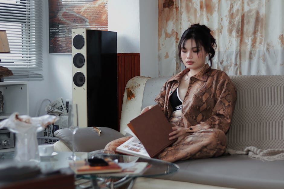
In 2024, subtle is out. Bold furniture is making a play for attention with dramatic curves, sculptural silhouettes, and oversized proportions. Think one big piece that holds the room visually — not clutter, just confidence. Designers and DIY vloggers alike are leaning into layouts that say something without shouting.
Walls aren’t staying quiet either. We’ve moved past the lone framed poster hung at eye level. Now it’s full gallery walls, oversized mural prints, and hanging fabric panels that bring dimension and personality. The result feels curated and intentional, not busy.
Even the accessories have something to say. A single ceramic vase can carry a whole mood. Coffee table books are stacked like declarations. Lighting isn’t just functional — it’s expressive. In a saturated space, the details make the difference. For vloggers, this shift offers storytelling gold: every object becomes a talking point, every setup says who you are before you say a word.
Micro-Niching for Loyal, High-Intent Audiences
If you’re creating just to chase views, you’re already behind. The strongest vloggers in 2024 are building around what they actually care about. The more personally dialed-in your niche is, the better shot you have at attracting an audience that sticks around, engages, and buys. Think less “content strategy” and more “what would I still talk about for free if YouTube disappeared tomorrow.”
Visually, smart creators are doing more with less. The trend is shifting toward clean, punchy color palettes that set a vibe without burning out the viewer. Neon-on-neon is out. Muted but bold is in. It’s all about balance that catches attention but doesn’t scream for it.
Most importantly, it’s not about flooding your content with everything you love. It’s about curation. Telling a clear, narrow story that your people can follow. You don’t have to be for everyone. You just have to go deep enough that your actual audience feels seen. That level of clarity wins attention now—and loyalty later.
Smart Gear for Lean Creators
Great-looking content starts with good equipment, but gear alone won’t save poor design choices. In 2024, creators are refining their production setups with intention. However, there’s still a common trap: prioritizing aesthetics over usability.
Looks Alone Don’t Cut It
A sleek setup may look good on camera, but if gear or visuals compromise clarity, viewers won’t stick around.
- Audio should be crisp and levels balanced
- Lighting must enhance the subject—not just look cinematic
- Focus more on the viewer experience than visual effects
Avoid Visual Overload
Too many flashy elements can distract from your message. Visual noise weakens impact, especially on small screens.
- Stick to a consistent color scheme and visual theme
- Use motion sparingly—every movement should have a purpose
- Establish a primary focus in each frame to guide the viewer’s attention
White Space is Not Wasted Space
In design and composition, less is often more. White space gives breathing room to your visuals and helps key elements stand out.
- Use margins and empty space strategically
- Don’t fill every corner just to avoid blank spots
- Let your visuals have rhythm and flow
Smart creators are leaning on tools that streamline with purpose—not just decorate. Great content isn’t about how much you can fit in, but how well you make each element work together.
Where layering meets harmony, design isn’t just about what you add—it’s about what you balance. In 2024, creators are taking eclecticism seriously by fine-tuning their mix of old and new. It’s not just slapping a vintage chair next to a chrome lamp. It’s thoughtful curation. A retro tile floor with clean-line cabinetry. A mid-century credenza paired with muted, contemporary textiles. It works because there’s rhythm.
This approach is less about contrast for contrast’s sake and more about visual conversation. Pieces that speak from different decades but align in tone, texture, or intention. Vloggers showcasing design walkthroughs or set tours are leaning into this style. It reflects a deeper story—not just what looks good, but what feels lived-in and layered with history.
For deeper inspiration, see Merging Vintage and Modern Eclectic Interior Concepts: Merging Vintage and Modern Eclectic Interior Concepts.
Why Maximalist Homes Feel More Personal
Maximalist homes aren’t about clutter. They’re about character. These are spaces that feel lived-in, layered, and unapologetically personal. Every piece—every color, texture, and framed memory—tells a story. While minimalism can feel curated to the point of sterility, maximalist spaces hum with emotion. It’s your playlist on shuffle rather than a pre-approved soundtrack. Messy at times, sure. But real.
There’s no wrong way to do it if it actually reflects who you are. That vintage movie poster next to your childhood photo? Perfect. The velvet couch against clashing patterned wallpaper? Own it. What matters is purpose. Edit, not just for aesthetics, but for feeling. Does the room still tell your story after you tweak it? Good. Do it again.
Maximalism rewards the brave. Take risks. Make changes. Then edit again. The beauty is in the ongoing dialogue between you and your space.


 There is a specific skill involved in explaining something clearly — one that is completely separate from actually knowing the subject. Vicky Skinneriez has both. They has spent years working with gardening and landscaping tips in a hands-on capacity, and an equal amount of time figuring out how to translate that experience into writing that people with different backgrounds can actually absorb and use.
Vicky tends to approach complex subjects — Gardening and Landscaping Tips, Home Improvement Essentials, Interior Renovation Ideas being good examples — by starting with what the reader already knows, then building outward from there rather than dropping them in the deep end. It sounds like a small thing. In practice it makes a significant difference in whether someone finishes the article or abandons it halfway through. They is also good at knowing when to stop — a surprisingly underrated skill. Some writers bury useful information under so many caveats and qualifications that the point disappears. Vicky knows where the point is and gets there without too many detours.
The practical effect of all this is that people who read Vicky's work tend to come away actually capable of doing something with it. Not just vaguely informed — actually capable. For a writer working in gardening and landscaping tips, that is probably the best possible outcome, and it's the standard Vicky holds they's own work to.

